Brand Identity · Office of Career Services IIT Delhi · 2022 Adopted institute-wide

Office of Career
Services identity

A career office, given a mark of its own. IIT Delhi's placement office ran on a logo borrowed from the institute seal — one that said whose it was, but nothing of what it did. I designed the mark, and the brand system behind it: a starling rising out of a sun, unveiled by the Director in August 2022 and now the face of the OCS across signage, stationery and screen.

Type Brand identity & guidelines
Client Office of Career Services, IIT Delhi
Role Concept, design & system — solo
Year 2022 · M.Des, IIT Delhi
Outcome Unveiled by the Director
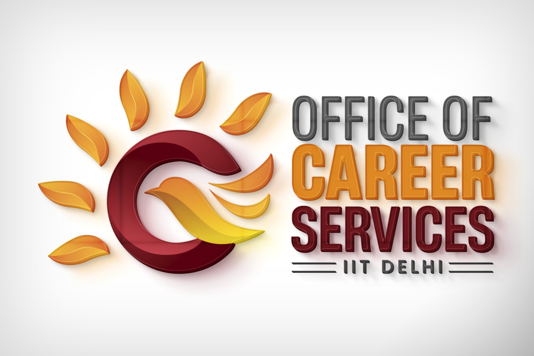
The official Office of Career Services, IIT Delhi logo — a maroon 'C' holding a rising sun and a starling in flight, beside the wordmark 'Office of Career Services · IIT Delhi'.

The mark, revealed — sun, starling and 'C', assembled

Why the old mark fell short

A borrowed seal,
a silent identity

The Office of Career Services is where every IIT Delhi student's move from campus to career actually runs — internships, placements, the relationships with recruiting companies. It is one of the most public-facing offices in the institute, and for a long time it carried a logo that could not do public-facing work.

The old mark was the IIT Delhi seal set between two ornaments. It did one thing well: it established, at a glance, that this office belonged to the institute. Past that it went quiet. It said nothing about what the office is for, and as a near-copy of a seal already in heavy use across the campus, it gave people almost nothing to recognise or remember it by.

The real problem wasn't aesthetic. The office needed to be understood in a second — by a student scanning a placement email, or a recruiter landing on the OCS page — and to sit inside a sixty-year-old institution without dissolving into it. That is a positioning problem wearing a logo's clothes.


The idea

The Rising Starling

I started from what the office would want said about itself, out loud, if it could. That gave me a short list of operative words to design toward — the tone the mark had to hold before it held any shape.

Bright future Elegance Success Growth Flight Pride Gentle

Those words resolved into a single image: a bird lifting out of a rising sun. The mark takes pride in the office's record and, in the same gesture, states its purpose — to give students wings and launch them into a future of success. Enough of a story to carry a logo, concrete enough to draw.

The office doesn't just place students. It gives them wings — and the mark had to do the launching.
What the emblem carries

One emblem,
three readings

The emblem is a single 'C' — for Career — engineered to be read three ways at once. Look longer and it keeps giving back meaning, which is exactly what a mark this office uses every day needs to do.

A rising sun breaking through clouds
01
The rising sun
The rays fanning out of the 'C' read as a sun coming up — vibrance, energy, and a bright future opening in front of the student.
A starling in flight, wings spread
02
The flying starling
Inside the sun, a starling takes off — a bird chosen for intellect, dexterity and a fighting, collective spirit. It carries the flight and the pride.
A grid of infinity-symbol explorations from the identity process
03
Infinity within
The concentric strokes of the 'C' overlap and fade into one another — a quiet infinity that stands for the open-ended range of paths a career can take.
A palette with a memory

Gradients that carry the legacy

The task in colour was to give the office energy without cutting it loose from the institute. I built the palette on gradients rather than flat fills, so the mark reads as lit from within, and anchored it in a deep maroon that echoes the IIT Delhi seal — a link you feel before you'd name it.

#660007
Emblem 'C' & "Services" — homage to the IITD seal
#F2762E
Sun-rays & "Career" — vigour and warmth
#666666
"Office of" & the IIT Delhi rule
#FFFFFF
Clear space — lets the emblem breathe

Before settling here, I worked two other directions to be sure — a brighter multi-hue gradient standing for the diversity of the disciplines the office serves, and a cool teal-to-blue reading of the OCS as the bridge between industry and academia. The sun-warm maroon won because it held both things at once: forward energy, and lineage.

How it's built

Two parts,
one system

The lockup is drawn as two separable parts — the emblem on the left, the typographic body on the right — so it can flex from a full corridor sign down to a compact avatar without losing itself. Everything downstream is specified so someone can apply the mark correctly without me in the room.

Structure
Emblem + typographic body — usable together or apart
Display type
Heading Now — a complete, all-weights sans chosen so the wordmark won't date
Supporting type
Poppins — geometric and even, for body and captions
Clear space
0.5X — half the emblem's width, kept clear on every side
Colour build
Gradients over flat fills, for depth and a lit-from-within read

All of it — history, concept, symbolism, colour, type, exclusion zones, variations and application rules — lives in a brand guidelines deck the office can hand to any designer or vendor.

↓ Brand guidelines (PDF)
The mark in the world

One mark,
many surfaces

The system was drawn to survive contact with the real world: reversed to a single colour on a wooden entrance sign, gilded on a wall, embossed across stationery, or dropped onto a card in the office's darker register. Same mark, different registers — and it holds.

From file to institution

Unveiled by the Director

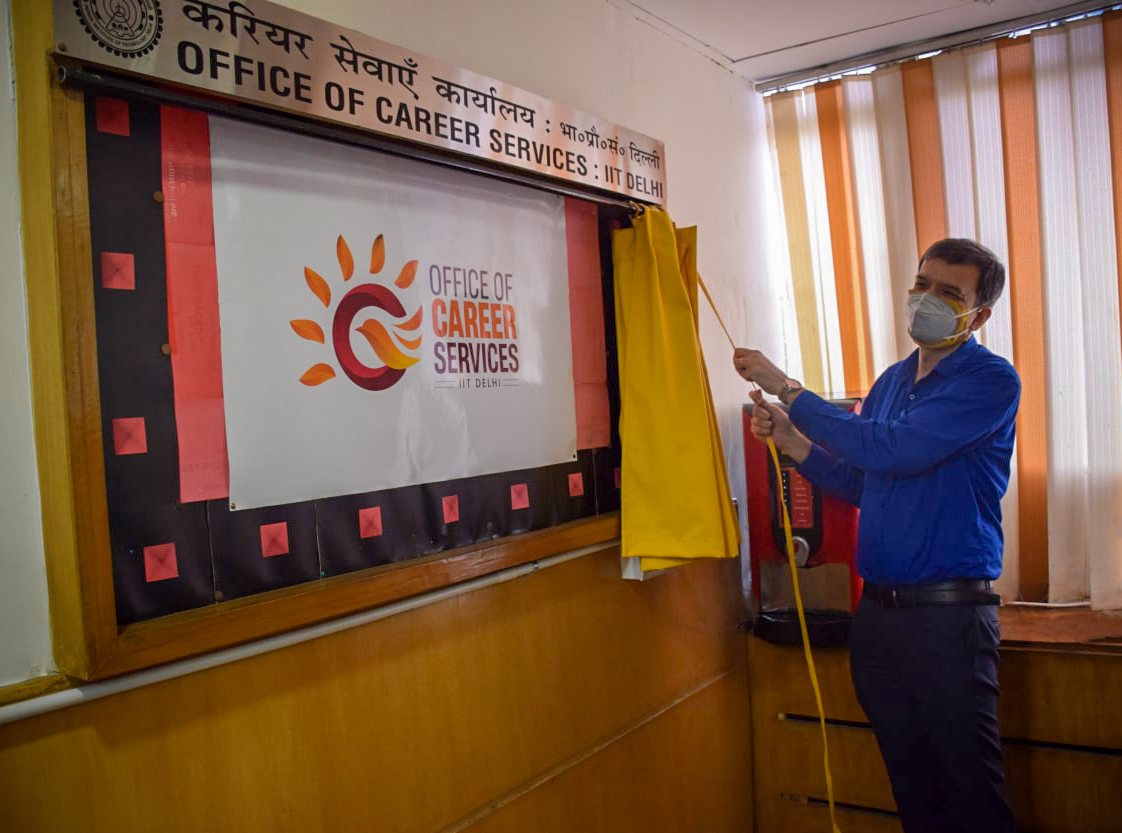
On 18 August 2022, Prof. Rangan Banerjee, Director of IIT Delhi, unveiled the mark as the official identity of the Office of Career Services — timed to open the 2022–23 internship and placement season. The institute described the logo as one that gives its students wings and launches them into a future of success and prosperity.

The Director of IIT Delhi pulling the drape off the framed OCS logo at the unveiling.
The unveiling The Director reveals the OCS identity · 18 Aug 2022

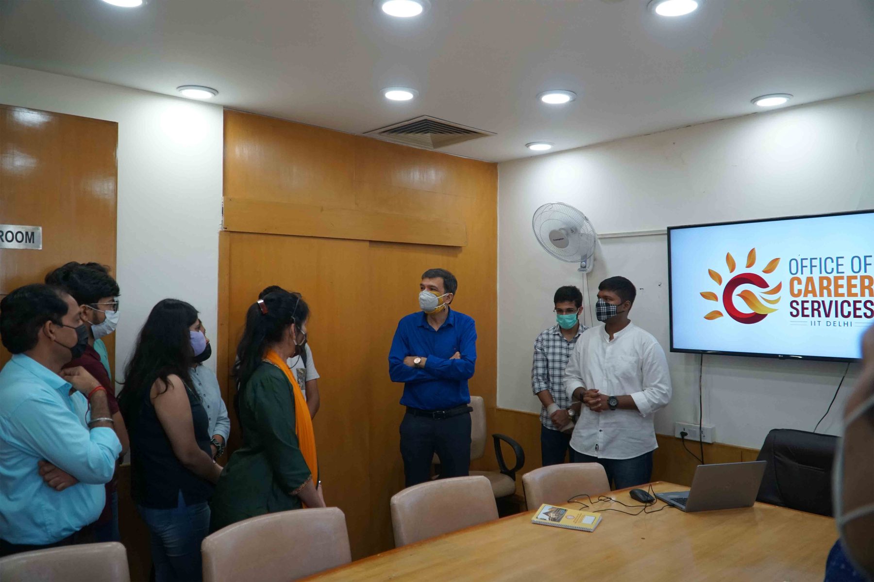
Dr. Anishya Obhrai Madan, who heads the OCS, framed the mark as capturing what the office works for — guiding students toward informed career choices, and giving shape to their aspirations for a bright future. Seeing my design read back to me in the institution's own words, as its own meaning rather than a designer's intent, was the moment the project stopped being a file and became the office's.

The Director of IIT Delhi interacting with the OCS team, the new logo displayed on a screen behind them.
Handover The Director with the OCS team, the new identity on screen
Unveiled by the Director, 18 August 2022Adopted as the official identity of the Office of Career Services, IIT Delhi.
Live across every surface the office touchesSignage, stationery, recruiter-facing communication and the OCS's digital presence.
A complete, handoff-ready systemGuidelines that let the office keep the mark consistent long after the project closed.

Source — IIT Delhi News: “Office of Career Services, IIT Delhi Unveils its Official Logo”

Why it still matters to me

Identity as a strategic act

A logo looks like a craft problem. This one was a positioning problem in disguise: an office that needed to be understood quickly by two very different audiences, and to belong to a storied institution without disappearing into it. Getting there meant diagnosing why the old mark failed, choosing an idea that said something true about the work, and building a system disciplined enough for other people to run without me.

That sequence — diagnose, decide, systematise, hand off — is the same move I now make on far larger canvases, most recently across the insurance vertical of SBI's YONO 2.0. Different scale, same discipline.

Want the fuller picture?

This was identity work under a real institutional stakeholder. The same thinking, at platform scale, is in the YONO 2.0 case study — and I'm always happy to talk shop.